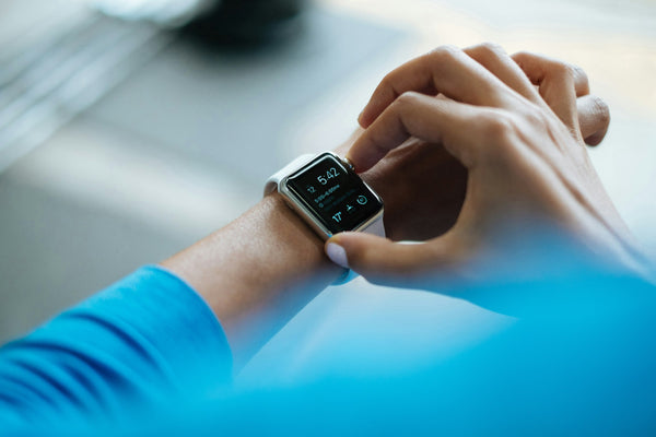

You check your watch over breakfast and there it is: a neat coloured bar breaking your night into Awake, REM, Core and Deep. Core is by far the biggest chunk, deep is a thin sliver at the bottom, and a small worry starts to form - am I getting enough of the good stuff? If you have ever squinted at that graph wondering whether "core" is a problem, this one is for you.

The short version is reassuring: core sleep is not a warning sign, and a big core number is completely normal. Here is what the term actually means, why the split you see rarely matters as much as it looks like it does, and how much faith to put in the numbers in the first place.
What "core sleep" actually means
The short answer. "Core sleep" is not a scientific stage of sleep. It is a label Apple chose for its Health and Sleep app, and in Apple's model it simply means light, non-REM sleep - the ordinary bread-and-butter sleep that makes up the largest part of any normal night. Sleep scientists would usually call this stage 1 and stage 2 non-REM sleep. Apple grouped it under the friendlier name "core".
So when your watch shows a big block of core sleep, it is showing you the light, non-REM sleep that every healthy sleeper spends most of the night in. It is not junk sleep or filler. It is the baseline your night is built on, and the stages you might think of as more valuable are layered into it.
Clearing up the "too much core, not enough deep" worry
This is the single most common thing people worry about when they see the graph, and it is almost always a misreading. On a normal night, light non-REM sleep genuinely is the majority of your sleep - typically around half of the whole night. Deep sleep, by contrast, is only ever meant to be a smaller share, usually somewhere in the region of 15 to 20 per cent, concentrated in the first few hours.
So a chart showing lots of core and a thin band of deep is not a chart of a bad night. It is what a healthy night is supposed to look like. Deep sleep matters enormously - we explain why in why deep sleep is more important than you think - but the point is that you were never meant to have huge quantities of it. A small, dense band of deep sleep early in the night is exactly right.
How the stages actually fit together
To make sense of the graph, it helps to see the real structure underneath it. Your night is not one long block - it runs through repeating cycles of roughly 90 minutes, and each cycle contains light sleep, deep sleep and REM. We walk through this properly in the different stages of sleep explained.
The key pattern is that deep sleep front-loads the night and REM back-loads it. Early cycles are heavy on deep sleep; later cycles are heavy on REM. Light, non-REM "core" sleep threads through the whole thing as the connective tissue between the two. So a normal graph shows deep sleep clustered at the start, REM building toward morning, and core spread across the lot - which is exactly the shape most people are looking at and quietly worrying about for no reason.
Does the split actually matter?
For most people, chasing the perfect ratio of stages is the wrong thing to fixate on. Your body is very good at managing its own balance - if it needs more deep sleep, it will prioritise it early in the night without any input from you. The far more useful questions are whether you are sleeping long enough overall, and whether that sleep is broken up or continuous.
That said, there is a version of this worry worth taking seriously. If you are consistently getting very little deep sleep and feeling genuinely unrefreshed - waking groggy, foggy and heavy every day rather than just curious about a graph - that combination is worth paying attention to. We cover what that can look like in signs you are not getting enough deep sleep. The graph alone is not the signal. How you feel is.
A caveat on wearable accuracy
Here is the part worth keeping in the back of your mind: a watch cannot directly measure your sleep stages. Proper staging is done in a lab with sensors on your scalp reading brain activity. Your watch is making an educated guess from movement, heart rate and heart rate variability - and while these devices have improved a lot, they are noticeably less reliable at telling deep sleep and light sleep apart than at simply detecting whether you are asleep or awake.
What this means in practice is that the exact minutes of "core" versus "deep" on any single night should be taken with a pinch of salt. The numbers are best read as rough trends over weeks, not gospel about last night. If your watch says you got barely any deep sleep but you feel great, believe how you feel over the graph. The tracker is a rough guide, not a diagnosis.
Frequently asked questions
Is core sleep good or bad?
Neither - it is just normal. Core sleep is Apple's name for light, non-REM sleep, which is the largest and most ordinary part of everyone's night. A big core number is exactly what a healthy night looks like, not a problem to fix.
Why is my core sleep so high and deep sleep so low?
Because that is the natural balance. Light non-REM sleep is meant to be roughly half your night, while deep sleep is only ever a smaller slice concentrated in the early hours. A thin deep band next to a large core band is the normal shape, not a warning.
Do Apple Watch and other trackers measure sleep stages accurately?
Only roughly. Trackers estimate stages from movement and heart rate rather than measuring brain activity directly, so they are decent at spotting asleep-versus-awake but far shakier at splitting deep from light. Read the numbers as trends over weeks, not exact facts about one night.
How much deep sleep should I actually be getting?
For most adults, deep sleep is around 15 to 20 per cent of total sleep, so on a full night that is often somewhere in the region of an hour or a bit more. It naturally declines with age, and you get most of it in the first few hours.
Should I try to increase my core sleep?
There is no need to target core sleep specifically. If you sleep long enough and consistently enough, and keep your nights undisturbed, the stages balance themselves. Aim for enough total, unbroken sleep rather than any single number on the graph.

The bottom line
Core sleep is simply Apple's word for light, non-REM sleep - the largest, most normal part of anyone's night. A graph heavy on core and light on deep is not a bad night; it is what a healthy night is supposed to look like, and your body manages the balance of stages far better than any dashboard. Treat the numbers as loose trends, pay more attention to how rested you actually feel, and do not let a coloured bar chart talk you into worrying about sleep you are getting perfectly well.
Try DreamMask - blocking stray light keeps your later cycles undisturbed, which does more for your sleep quality than chasing any tracker number.
Try DreamMist - a consistent wind-down cue helps you drop off and stay settled, so the stages balance themselves without you watching the graph.
Sleep well. Sleep properly. SleepyDeepy.